Colin Cowherd Reveals His 2025 NFL Mock Draft: “What I Would Do” Edition
Colin Cowherd is never short on strong opinions, and his annual...

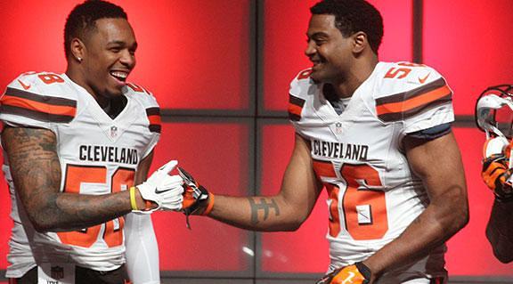
In case you missed it, the Cleveland Browns unveiled their new uniforms for 2015-2016 season. Amongst a webcast on their official website the Browns claimed they were ushering in a new era in what was supposed to be “the Oregon of the NFL” of uniforms.
Then… the uniforms were released. And I could say I was not excited by the new combinations.
My review:
First there is the helmet. It is still practically the same. Yes, the orange is now red-orange, but they promised something “radical.” In the end, same old helmet with a brown grill. I don’t know what would have been a “radical” edge to this design though. It gets the job done, I guess.
The uniforms look like something out of the MAC Conference. The numbers are huge and embossed, not to mention the odd look of a color-on-color scheme. Red-orange numbers on brown uniforms? Excuse me while I rinse my eyes out with water.
I do like the ‘CLEVELAND’ text on the front of the jerseys, as well as the bold ‘BROWNS’ text that runs down the legs alongside a half stripe. It certainly updates that part of the jersey sufficiently.
However, the biggest issue on these uniforms besides the numbers are the sleeves. They just don’t look right. Either they are too high or run too long across the jersey, I really can’t put my finger on it. The stripes almost look like wings of some sort and I’m sure that’s not what they were going for.
All in all, this is another miss for NIKE in my mind. Outside the Seahawks new jerseys NIKE has missed in their attempts to update NFL jerseys. Sometimes classics need to be left alone… and never should fans have to endure orange numbers on brown jerseys.
2 Comments